Shows how simple statistical methods can help clean obtained data and find bottlenecks for load testing.
Usually there is a goal for a load testing otherwise why do that. It could be stated as “system should be able to handle X concurrently working users with latencies not higher than Y and zero errors using hardware not larger than Z”. “Premature optimization is the root of all evil” principle usually leads to a system not being able to handle even X/10 users when development of most important features is done. In that case load testing transforms into iterative tuning process when you apply load to the system, find bottlenecks, optimize, rinse and repeat until X emulated users are happy.
There are some important points to be aware of. First is a transient response:
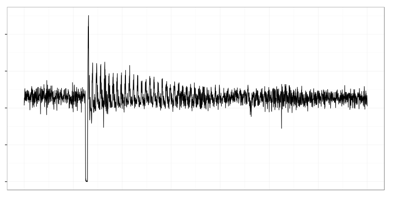
It’s a request rate (vertical axis) on a system which was restarted. Horizontal axis here and on all following graphs is time. It was noisy but relatively stable in the left part then it dropped to zero when the system was down then something strange happened: requests started arriving in waves. Later it returned back to the same noisy behavior.
In practice transient response means that you need to wait until system metrics become stable after you apply load to the system.
Second point is a sampling rate of metrics measurements. If interval between measurements is larger than a wave duration on a graph above you won’t see any waves. There might be several randomly placed spikes and you might not even notice that there was a restart because the system could stop and start between two measurements.
The higher the sampling rate the better it is for load testing. Failure usually happens within seconds (milliseconds). If you collect system metrics once in 5 minutes you’ll get healthy system and at the next moment it’s completely broken. Failure of one component often have cascading effect and brings down several others. With infrequent measurements you’ll not be able to identify which one was first to fail.
Measurement overhead and storage size puts upper limit on a sampling rate. There are not so many opensource monitoring systems which are capable of receiving and storing thousands metrics per second. In practice it’s possible to collect metrics with 1 second interval for relatively small systems (several hosts) and with 10 second interval when you have more than 10 machines. I hope that the progress will make that statement obsolete soon.
Load Test Example
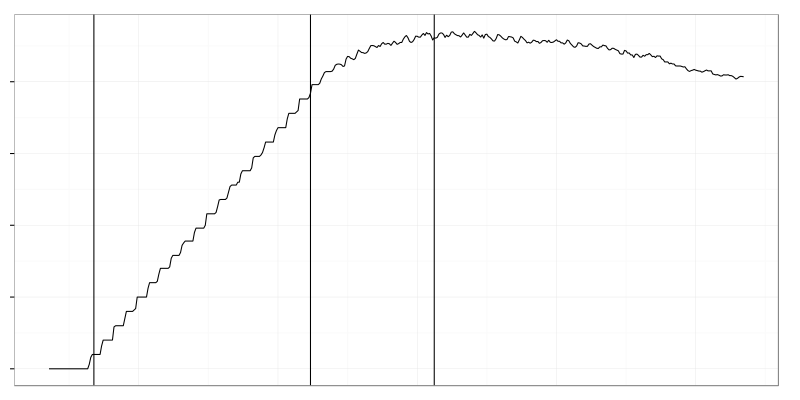 Vertical axis is number of connected clients measured by a system itself and horizontal is time. Clients were connecting to the system in batches with several minutes interval to allow it to stabilize. These steps are quite clear in the left part of the graph. Then something broke and starting more clients didn’t result in more clients being connected. Then even already connected clients started to drop off.
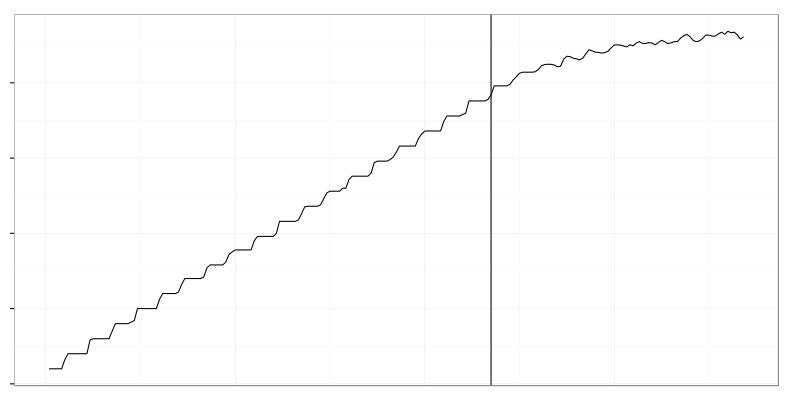
I’ve cut two adjacent ranges from whole time of the test divided by the point when arrival rate of clients slowed down. As we’ll see later it’s not that important to find the point exactly because some metrics could change both before and after the point. Now we have two time ranges (“good” and “bad”) to compare and the whole set of metrics gathered. Let’s find what’s broken in the second time range by comparing it to the first.
Data Filtration
Thousands metrics is a lot even for simple algorithms so we need to reduce their number somehow. Closer look reveals that there are a lot of metrics which either don’t change at all (allows to throw constant metrics away) or change not a lot.
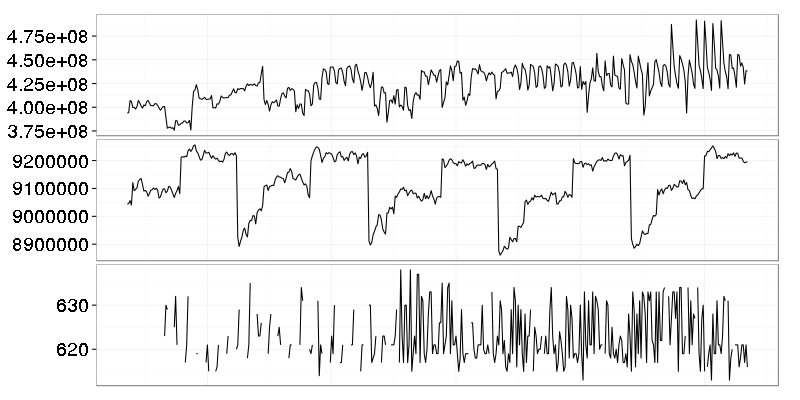
These metrics seem to have something going on until we plot them with Y range starting from 0.
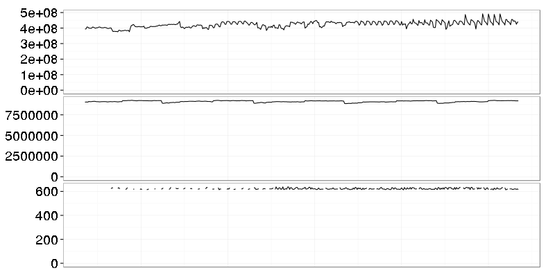
Now it’s clear that nothing serious happens there. Coefficient of variation is small for them which allows to throw them away using simple threshold criteria.
Tasks migrated by OS scheduler produce step-like changes (mean-shifts) on per-cpu usage graphs. It might be a problem when it happens too often but for coarse-grained analysis it’s better to start with total cpu time instead of per-cpu.
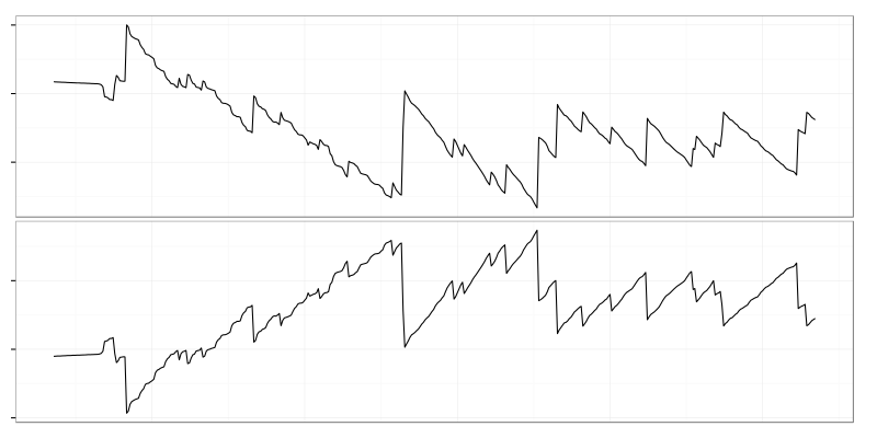
Disk used and disk free space (picture above) are dependent on each other and produce mirrored graphs so only one of them (disk free space) is really needed for analysis.
Another group of thrown away metrics might be summarized as “idle system noise”. There might be something like ntpd running on unused machine. It does its job but we don’t care because that kind of activity doesn’t affect anything which allows to set thresholds on maximum values:
- cpu user time < 5%
- interface traffic < 10 packets/s
- load average < 0.5
- …
Finding Bottlenecks
First thing to look for is if there is something that was missing or constant in “good” range and then appeared or changed in “bad” range. It usually reveals error rate metrics like these:
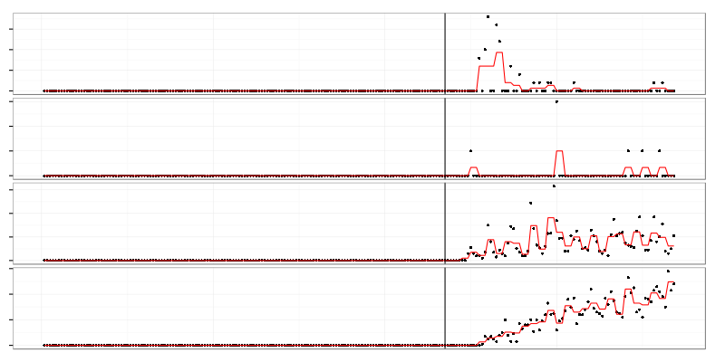
These metrics turned out to be various tcp connection errors (abort on data, abort on close, etc.) on overloaded load balancer.
Then there are metrics which have different mean values on “good” and “bad” ranges:
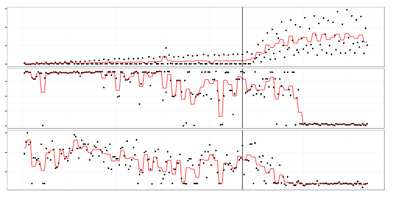
Top graph on this picture is a disk write rate on application server. Linear growth on “good” range is caused by logging of regular clients’ activity (we were adding new clients almost linearly). Jump in “bad” range is caused by logging of errors happening when the system became overloaded.
It might be possible to compare standard deviation between “good” and “bad” ranges to find if something hits the limit which reduces variation. In my case it didn’t find anything interesting so no picture for it.
In ideal world system should scale linearly which means that all metrics should either be constant or linearly dependent on load applied. Anything that grows faster than linear is a potential bottleneck.
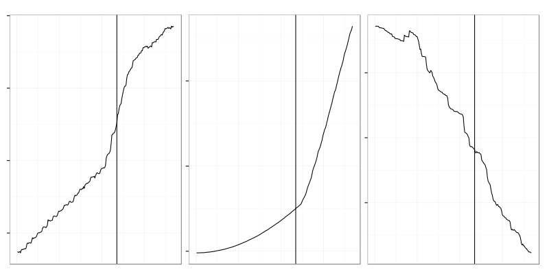
Left graph is an amount of memory used on load balancer. It changed behavior from linear growth to explosion in “good” range but it didn’t result in dropping clients immediately. Usually there is no single point in time when everything gets broken. The root cause of failure might flip earlier than we notice it on target (number of connected clients there) metric.
Graph in the middle is an amount of memory used by OS filesystem cache on application server. It has growth pattern that looks like quadratic in “good” range and then it exploded in “bad” range. Constant load makes application server write logs with constant rate which fills FS cache linearly in time. If the load grows linearly too (as it was done in this case) then two linear trends multiply and result in quadratic growth which is OK there. Explosion in the “bad” range is caused by error logging which adds up to regular logs.
Graph on the right side is a typical example of noise caught by nonlinear detection algorithm. It’s nonlinear but has the same behavior in both ranges which makes it irrelevant for us because it doesn’t indicate bottlenecks.
The way I found nonlinear growth there involves a little bit of cheating. I used ndiffs function from R. Ideally I should have found derivative of each metric with respect to load applied (number of clients running) and checked if it’s constant. Instead of that I used the fact that clients were added almost linearly in time and load could be replaced by time.