Introduces performance metrics and their properties that affect choice of algorithms for anomaly detection, performance analysis, capacity planning. There will be several examples that illustrate typical properties and anomalies.
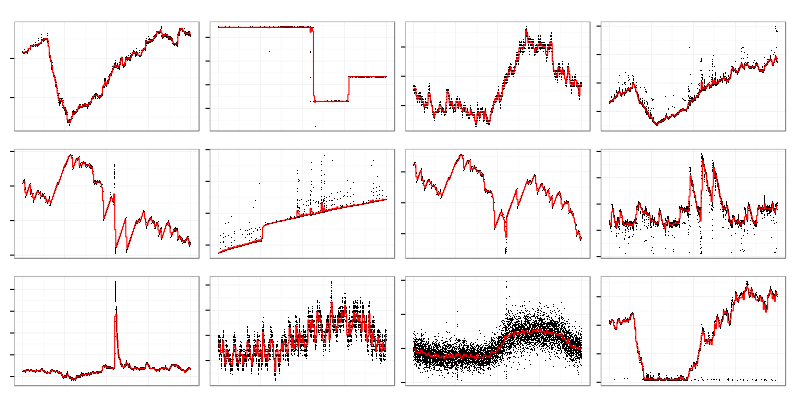
Here’s the way typical performance metrics look like. CPU utilization, used memory, network io, disk io, etc. are drawn as time series. I’ll put no labels on axes because horizontal line is always time and vertical line is a value of some metric. There are cases when it helps to know what kind of metric we are analyzing but in general it doesn’t matter for statistical purposes. Sometimes all you know about metrics is their names and only developers can shed a light on meaning of a particular metric.
This style of visualization when black dots are individual data points and red curve is an averaged over some period value will be used for graphs. It allows to quickly see both data distribution (darkness of dot cloud) and its trend.
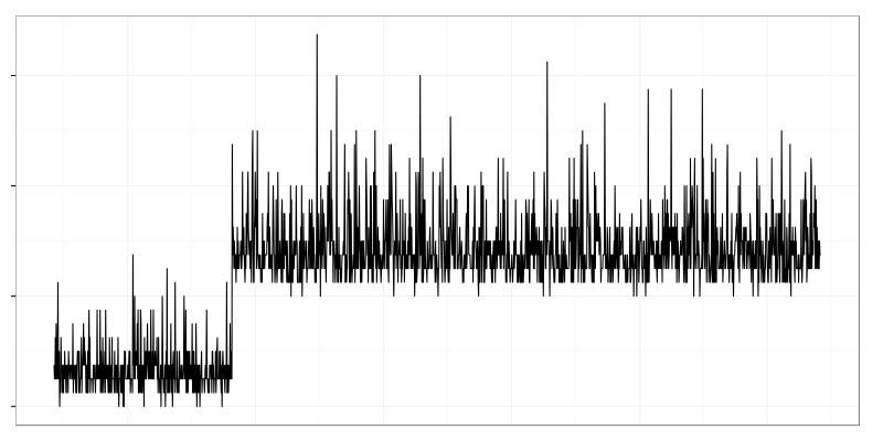
There are several interesting things on the picture above. One service crashed and was restarted which led to spikes on some graphs and drops on others. Another service is leaking memory which looks like a linear growth.
It helps a lot to have good understanding of a system (OS and application) when you are investigating performance problems. But sometimes you have no idea of what’s going on. In that case you have to check a lot of metrics in hope to find something interesting and related to the problem.
Humans are good at pattern recognition so they can spot trends and changes on graphs. I used to navigate through hundreds of graphs while investigating production problems but it doesn’t scale well. If you install metrics gathering agent (like collectd) on your server it’ll produce hundreds metrics. If you have dozen servers it’ll produce thousands metrics which is impossible for human to review on timely manner.
Faced that problem I noticed that I follow quite simple steps while analyzing data visually. I look for graphs which have some kind of change in their shape when things got broken or I’m looking for similar graphs (e.g. something that has spikes at the same time as error rate has spikes).
Statistical tools can spot some trends and recognize some patterns too. There is a whole body of knowledge on change point detection and clustering (grouping similar objects). With their help human can handle more data by looking only at interesting graphs and skipping unrelated noise.
When I started learning statistics I found that computer generated data is quite different from the ideal world of statistical models because of:
- Noise. At any point in time there is some change happening. System administrators do their job reconfiguring and restarting stuff, cron jobs are running, clients come and go. Sometimes it is a signal (e.g. mistake in reconfiguration which led to broken service) and sometimes it’s just a noise. If your servers happen to be in a cloud then latencies might come out of nowhere unrelated to your users’ activity.
- Outliers. In any dataset there will be some points that don’t make sense at all. They drive averages off their reasonable value and screw up many algorithms. Typical example is a counter wrap around when it jumps from maximum value to minimum.
- Missing data. Monitoring systems have their own failures and network is not reliable so you’ll have gaps in you metrics. Many useful methods don’t handle gaps. You have to either put some made up values into gaps or use other methods.
- Different sample rates. Some things change quickly so you measure them frequently and some don’t. It makes no sense to report disk usage 10 times a second because it’s impossible to fill up 2Tb drive in one second but you’ll report network traffic quite frequently to find out micro-bursts that overflow buffers of you network switch.
- Counter update frequencies. Virtual memory subsystem in Linux kernel has a configurable statistics update interval which is 1 second by default. You might get strange results if you try to fetch that data more that once a second. Some counters will change only once a second and others will return non-zero value only once a second.
- Quantization. Some things could be measured only in natural numbers (like process count) and some metrics have limited precision. It confuses algorithms that expect continuous distribution of values. Actually most computer generated metrics are integers.
- Data distribution is not Gaussian. While it might be common in biology or physics it’s very rare in system metrics.
- The biggest problem is that in many cases nobody knows what’s normal for the system being monitored. When a web service replies with HTTP 50x codes for all requests and logs huge stacktraces then it’s clearly broken but there might be several retry/fallback layers which hide underlying problems from end users.
Examples
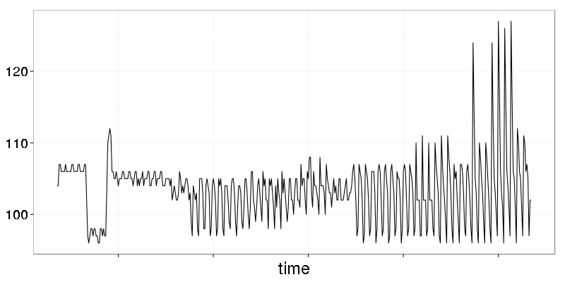
The graph above is a metric with visible quantization. It’s not that obvious when all datapoints are connected by lines. Let’s see how it looks like if lines are removed.
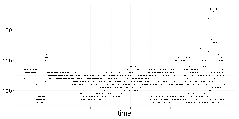
Dots are placed on horizontal lanes. Let’s make a histogram with bin width 1:
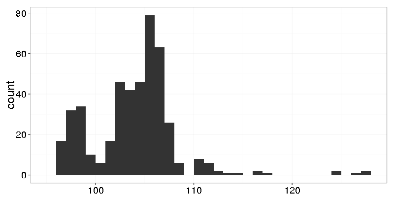
Nothing interesting. Let’s make finer grain histogram with bin width 0.25:
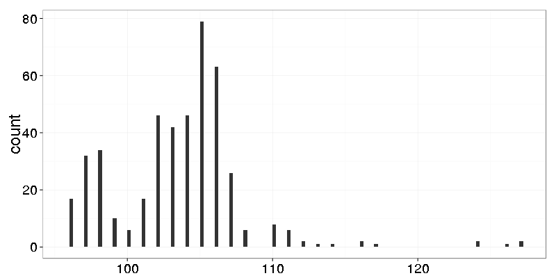
Now we see that the data has only integers.
It’s a typical changepoint which is well known as a ‘mean shift’. CPU usage of data processing service grew when new data producer was added.
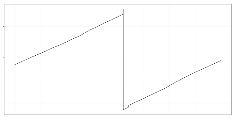
It’s used disk space when large log file was deleted by logrotate. There is an almost linear trend (though it has some noise in it) followed by abrupt drop.
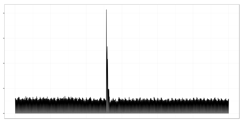
Closed tcp sockets per second. One system crashed and a lot of clients got disconnected which resulted in large spike on the graph.