Finding metrics with similar behavior and analyzing internal system dependencies.
There are a lot of situations when you see an unexpected change in one metric (e.g. increased latency or error rate) and need to find the cause. It could be solved by applying prior knowledge about dependencies in the system but there are still a lot of unknowns especially in case of poorly documented legacy applications. It would be great to have a tool that given a metric produces a list of other metrics it depends on based on time series data.
There are some papers (e.g. “Causality and graphical models in time series analysis”) suggesting that it’s possible to infer dependencies from time series data but I haven’t done any experiments with it yet (R package vars might be useful).
For practical purposes it’s often enough to find metrics that have similarly shaped graphs. Changes in computer systems are quite fast (seconds or milliseconds) to propagate between components making it impossible to find out what changed first with typical polling intervals (10s, 60s) so it looks like dependent metrics are moving at the same time.
There are several methods for finding similar time series:
- correlation (Pearson, Spearman)
- Euclidean distance
- dynamic time warping (DTW)
- discrete Fourier transform (DFT)
- discrete wavelet transform (DWT)
Actually there are much more targeted at different use cases and the list above contains only most popular ones. The good news is that performance monitoring data is quite small in comparison with ECG and EEG data. It gives a hope that more effective methods from medical field will be used for performance monitoring too.
First two are quite simple to understand and fast in runtime. Pearson correlation coefficient has a simple relation to Euclidean distance for normalized data. Absolute value of correlation coefficient allows to find mirrored graphs (like disk used vs. disk free space).
Dynamic time warping has a nice property to find slightly misaligned in time graphs but its R implementation was too slow to be useful when I tried it.
My experiments with DFT failed because computer-generated metrics rarely have sparse representation in frequency domain. Their spectra are wide and contain a lot of frequencies. There is not so many periodical things (maybe cron jobs) going on in online request processing. There are seasonal daily/weekly/yearly changes but the typical need to compare graphs is limited by short ranges (hours or even minutes).
DWT looks promising because Haar wavelet’s shape is very similar to step-like changes usually found in performance metrics but I haven’t tried it yet.
Sometimes production system misbehaves but you have no idea where to start from because known dependencies and similar graphs for usual suspects (metrics like error rate) lead nowhere. Going through all metrics and watching all graphs works for small systems (up to several hundreds metrics) but doesn’t work when there are thousands metrics. While trying to do that I noticed that many graphs are almost the same making it unnecessary to get through all of them.
Clustering allows to group similar metrics and reduce amount of data to analyze. It makes possible to take only single representative from each group of similar metrics. I used Partitioning Around Medoids clustering algorithm and absolute value of correlation coefficient as a distance function.
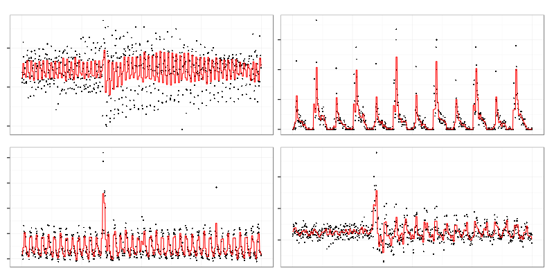
These 4 graphs were taken from a set of cluster representatives.
Contents of a cluster represented by the top right one:
There are 2 quite similar graphs on top (actually there were more omitted from illustration) but it contains some noisy graphs (bottom) which don’t look really similar to others. Clustering algorithm used requires exact number of clusters to be set upfront which leads to the result above because it has to assign graphs which are not similar to anything to some clusters.
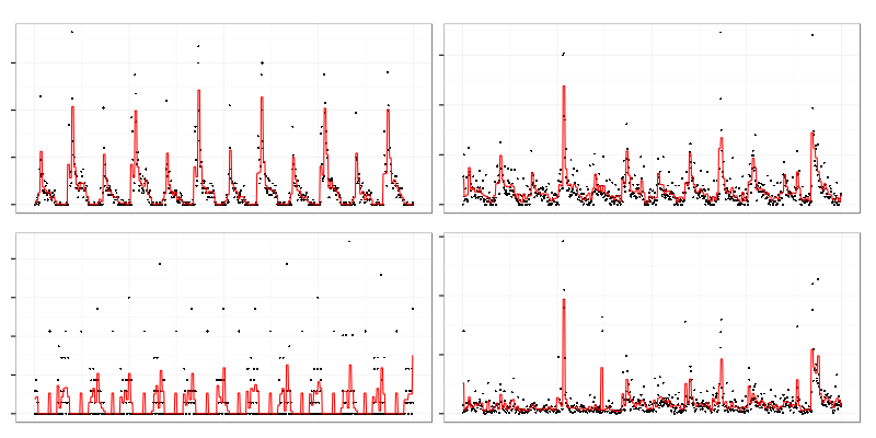
This is another cluster with different contents. Top right graph looks like periodical exponential charge while others are more like sawtooth wave or triangle wave. Relation between those graphs is clealy non-linear.
Spearman’s rank correlation coefficient was used to create these clusters because it allows to catch non-linear relationships between metrics. It’s more computationally difficult than Pearson but produces better results because there are a lot of non-linear dependencies in computer-generated data. It allowed me to find misconfigured cache expiration which wiped too much data from the cache and periodically overloaded service behind the cache (note to self: don’t forget to monitor cache-miss ratio next time).
Problems with clustering monitoring data:
-
Non-euclidean (ultrametric) space. Many clustering algorithms require distance function to be Euclidean metric while useful time series comparison functions (like correlation coefficient) are not. It limits set of available algorithms.
-
Many small clusters. There a lot of almost independent metrics which produce large number of small clusters. It makes harder to set number of clusters for algorithms that require it. If you set number of clusters too low there will be a lot of unrelated noise in each cluster but if you set the number too high the original purpose (to reduce amount of graphs to watch) will be missed.
-
Local clusters around events. Each event like service restart tend to gather a lot of metrics into single big cluster. It might be good for investigating outages but it’s bad for finding dependencies in a steady state. It’s better to choose quiet time range without any significant events for the latter use case.
-
Correlations which are not dependencies. If two metrics rise and fall at the same time their correlation coefficient will be close to 1 (or -1 for mirrored graphs) but in general correlation doesn’t imply causation. There are a lot of cases where independent events happen at the same time like:
- cron jobs (e.g. log rotation)
- human actions (cluster restarts, reconfigurations)
- timed cache expirations
Cluster structure often tells obvious things like grouping all metrics related to a single service into one cluster. But sometimes it uncovers something new like dependency between latency of one application and disk IO of another unrelated one which turned out to be using the same storage array.