Experimental anomaly detection methods based on autocorrelation and non-parametric 2 sample tests.
Autocorrelation helps distinguishing between metrics that have changing behavior and stable ones.
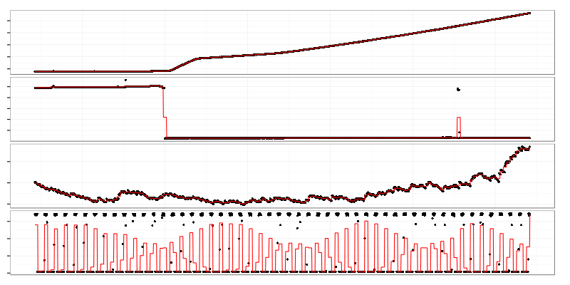
These are different kinds of graphs that have high Ljung–Box test statistic which is based on autocorrelation coefficients at different lags.
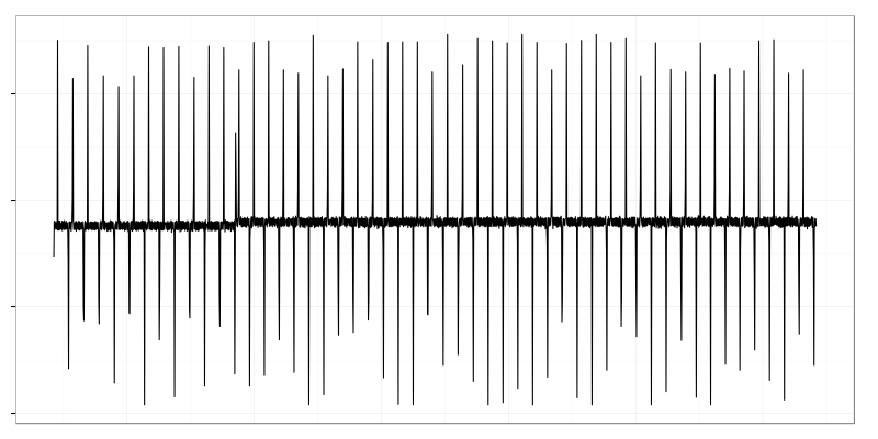
Ljung-Box test is good at finding graphs with non-flat trends and mean shifts. The downside is that it finds graphs with seasonal changes, oscillations, already aggregated data (like load average which is EWMA). 2 bottom graphs on the image above are load average and some oscillating metric.
Control-charts based methods mentioned in Part 1 don’t work for data with relatively stable mean (which changes fall withing three-sigma range):
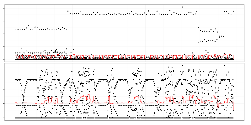
Both graphs clearly show different behavior at different time intervals but changes in mean value (painted red) are quite small in comparison to standard deviation to be noticed by control-charts.
Another bad example are metrics that represent request latency or size.
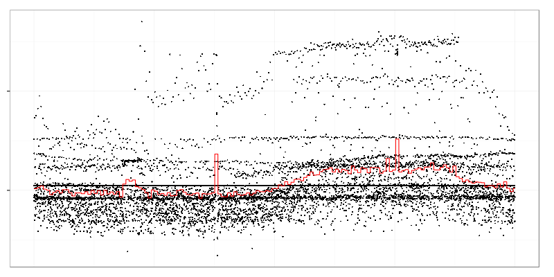
This weird graph shows maximum request size (black dots) measured over 10 seconds intervals during a day. Red line is an average over 3 minutes intervals. There are some spikes in average value but there is also a strange dot cloud in top-right part which stands for heavy requests appearing in that time of day.
In case of latency data distribution is not bell shaped. It usually has a long tail (some requests are taking much longer than the rest) which produces a lot of false alarms when using control charts.
It’s possible to find changes in such kinds of data by using non-parametric 2-sample tests like Kolmogorov–Smirnov test or Cramér–von Mises test. These tests allow to find how different two sets of data are.
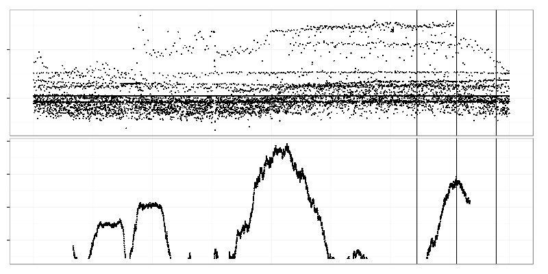
Here we select 2 adjacent time intervals (right side of the top graph) and compare data drawn from them using Kolmogorov-Smirnov test. Value of test statistic is put on the graph below on the line between those 2 intervals. Time intervals are quite large here (2 hours) so the bottom graph shows only large-scale changes. Two highest peaks on it represent times when the heavy request cloud appeared and disappeared.
There is a visible mean shift (left side) which is hidden from control charts by large standard deviation.
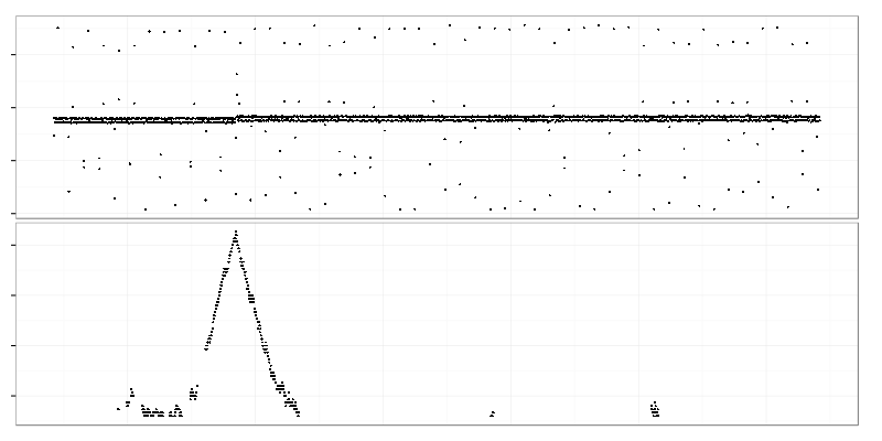
The maximum of Kolmogorov-Smirnov test statistic (bottom graph) points exactly to the point of change.
This method (find maximum of 2-sample test statistics between 2 adjacent sliding windows) is:
- good for request size and latency (e.g. times to process request taken from web server logs);
- works on periodic data when its period is smaller than the window size;
- outlier resistant (less sensitive to small-scale changes with larger windows);
- good for data exploration (starting with large window size allows top-down exploration of large-scale changes first).
Drawbacks of the method:
- produces false positives on trends and seasonal changes (that’s bad because a lot of metrics from production systems have at least daily regular changes);
- needs many (hundreds) unique values (it won’t work on metrics gathered with 5 minutes interval);
- computational complexity;
- bad for alerting because of false positives.
The main use case for the method is to find the time range when something (maybe good, maybe bad) happened and someone might need to read logs from that time. Another case is to find metrics that did change behavior at some known time when we know that things got broken but don’t know exactly why.